Year
Industry
Services

About the project
Smash! entered this project with a clear need: a visual identity capable of supporting the brand’s growth while functioning consistently across all applications. Although familiar to its audience, the previous logo had a structural flaw in its construction. In real-world use — such as on the physical storefront — the central letters “A” and “S” were visibly cut off, compromising legibility and weakening the brand’s presence at a distance. The challenge was to redesign the brand without losing recognition, correcting the technical issues of the old logo and creating a more professional, versatile visual system prepared for expansion both in physical spaces and digital environments.

Concept
The new Smash! concept builds on the same energy that has always defined the brand: young, vibrant, and unapologetically bold. The redesign was developed to amplify this personality while adding clarity, graphic strength, and technical precision. The identity now communicates not only the fun and dynamic experience of a smash burger, but also the consistency of a brand that knows exactly how it wants to be perceived — authentic, energetic, and unforgettable.

For the new visual identity, the logo was rebuilt with a focus on legibility, balance, and visual impact. The typography was redesigned to achieve greater structural stability, preventing the distortions and cutoffs that previously affected the “SMASH!” name in signage and other physical applications. The improved letterforms ensure clear and complete readability at different scales and distances, giving the brand a stronger and more reliable presence.
A vibrant color palette, expressive graphics, and supporting patterns reinforce the brand’s modern, irreverent and playful character. Together, these elements create a cohesive and recognizable visual universe that reflects Smash!’s personality across all touchpoints.


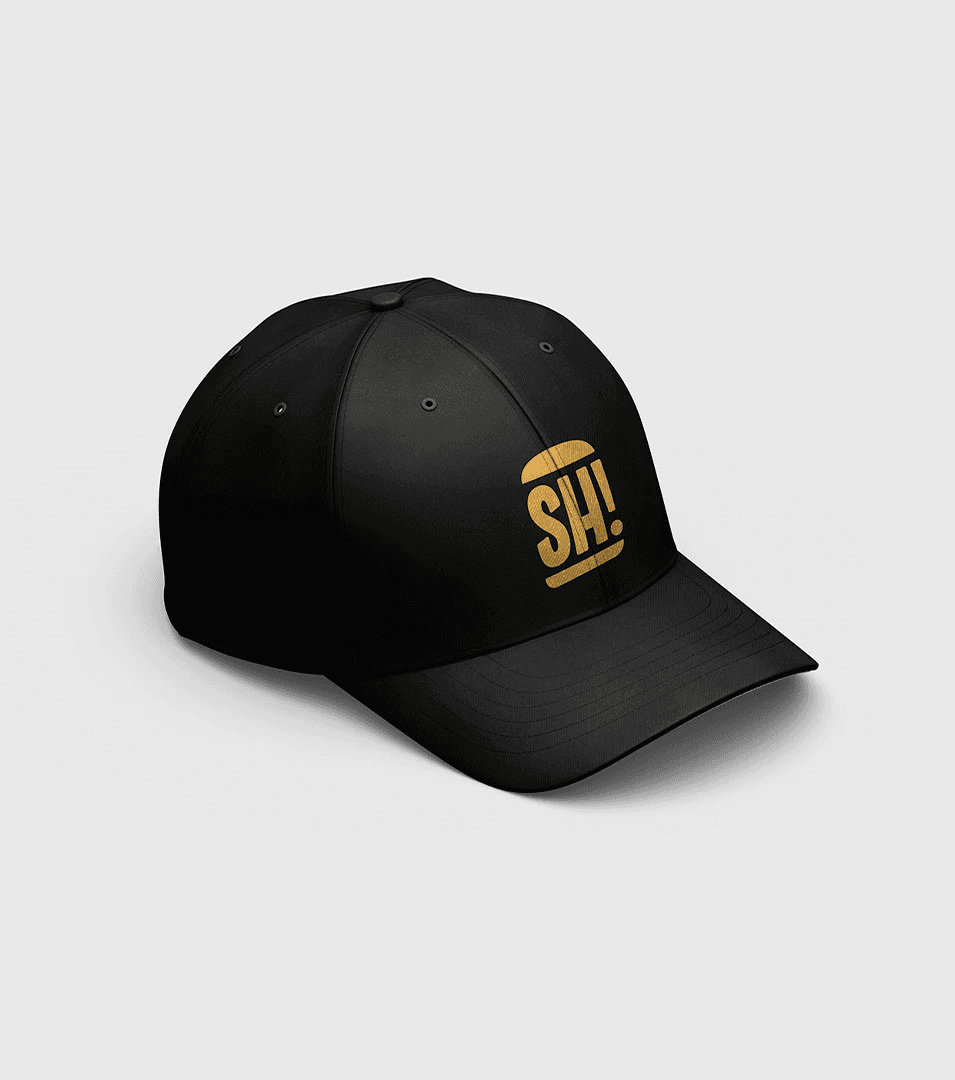
The applications demonstrate how the new logo and visual system perform with greater technical confidence across packaging, exterior signage, digital communication and promotional materials. Storefronts, uniforms, social media and printed pieces now present a brand that is fully resolved, legible, and visually striking — positioning Smash! as a hamburger brand with a strong identity, professional structure and readiness to scale.