Year
Industry
Services

About the project
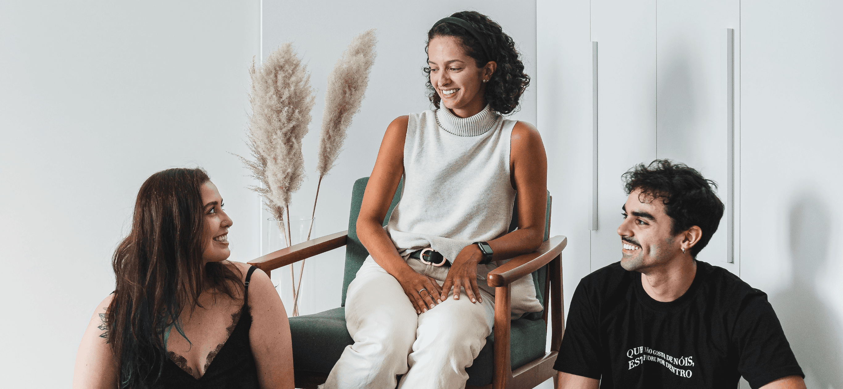
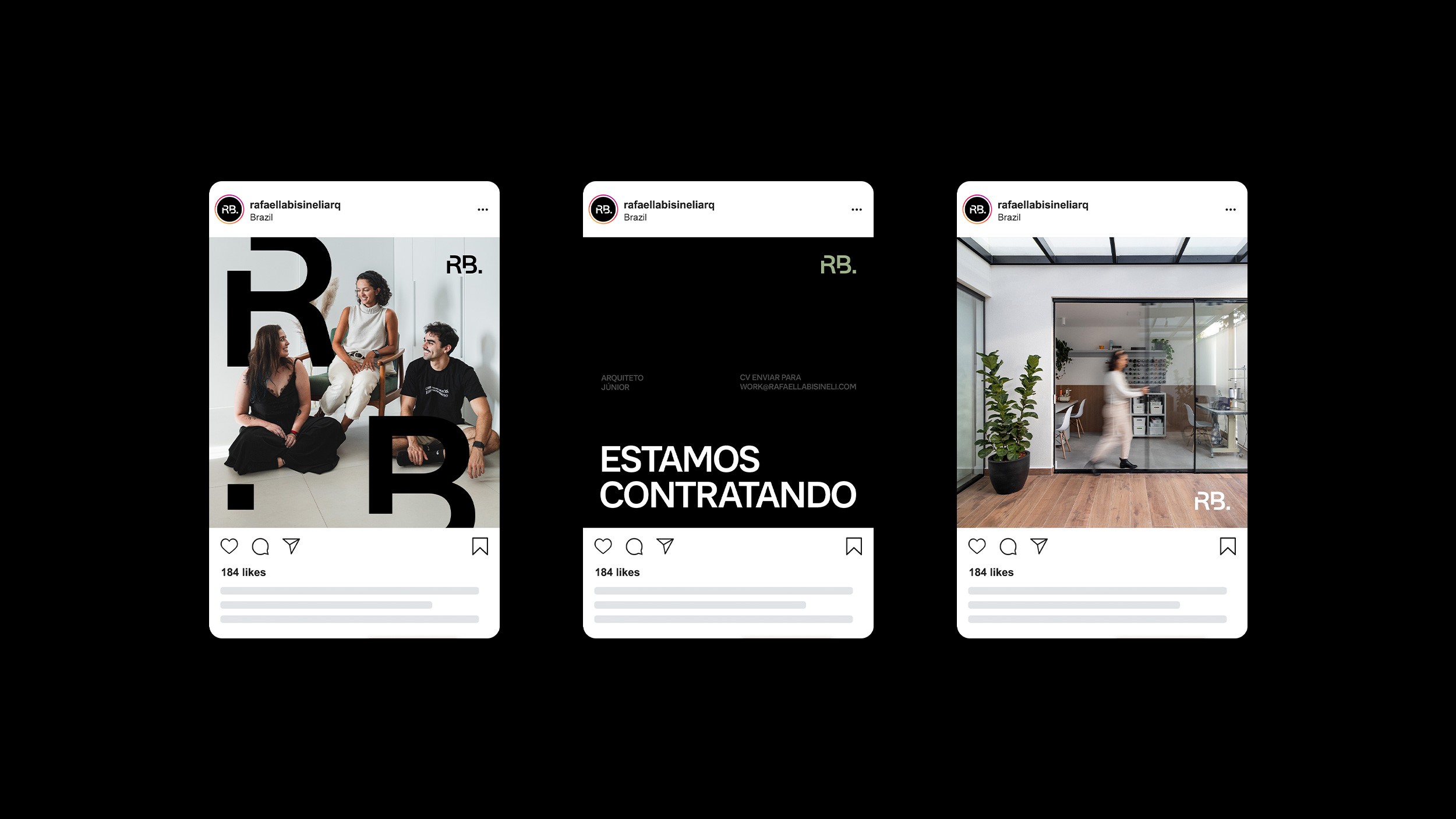
This project introduces the new visual identity for the remote architecture studio led by Rafaella Bisineli, working alongside architects Caio Alencar and Pietra Comelli. The proposal establishes a contemporary and elegant visual system designed to strengthen the studio’s collaborative approach and its commitment to transforming clients’ stories into meaningful spatial experiences. The material defines brand personality, color palette, typography, and moodboard, providing a consistent foundation for future applications across all communication touchpoints.
Concept
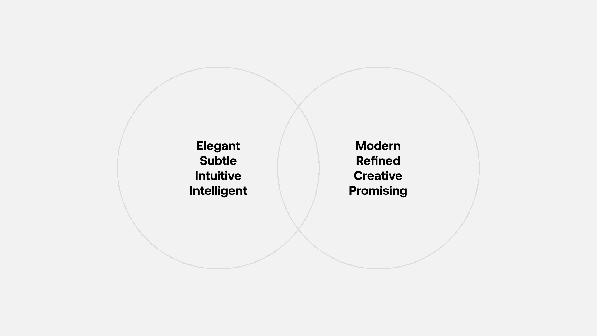
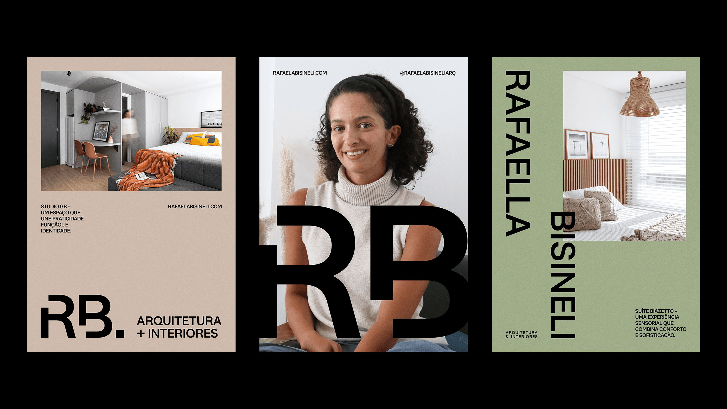
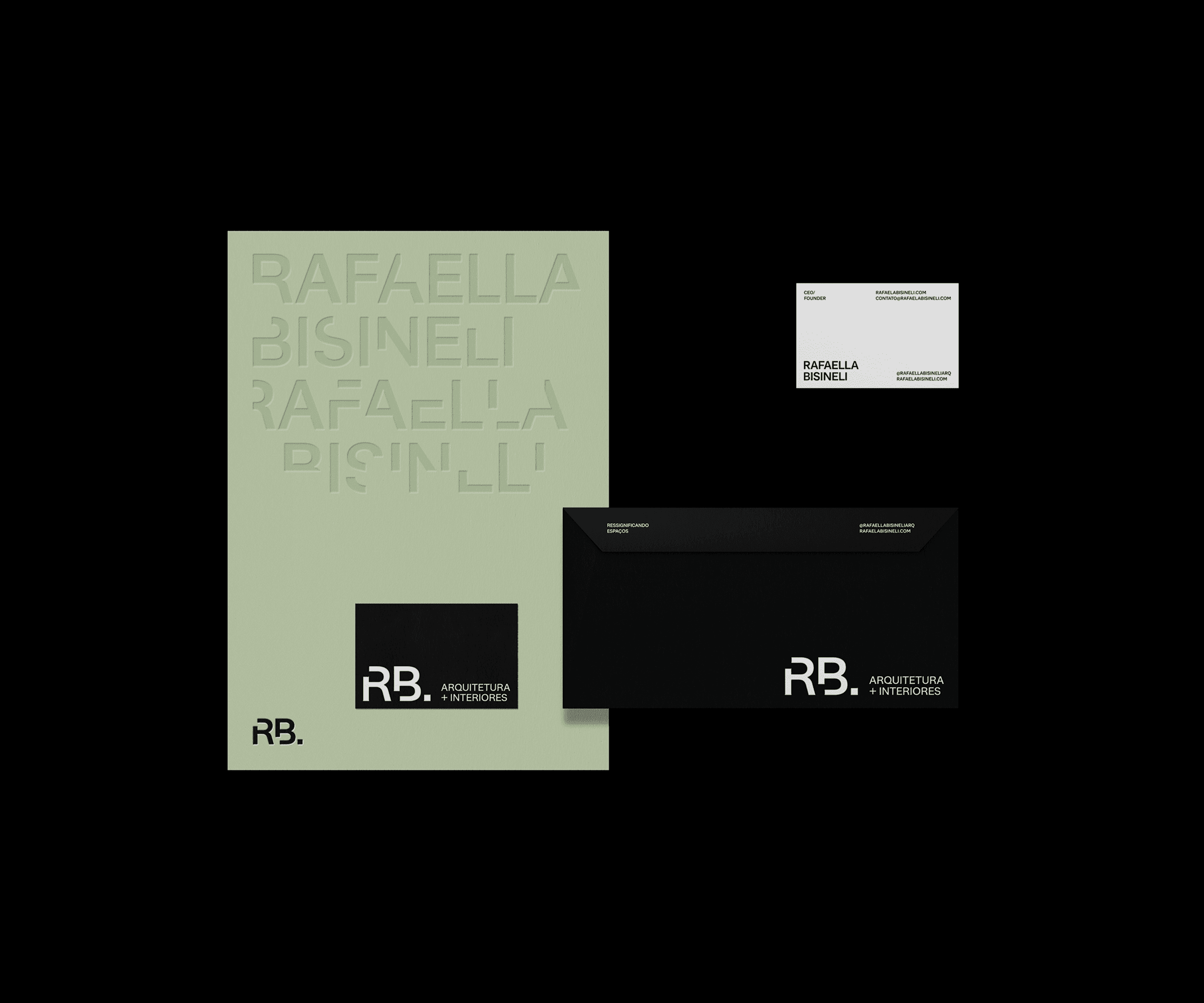
The new visual identity for the remote architecture studio led by Rafaella Bisineli, together with Caio Alencar and Pietra Comelli, is built upon the principle of creative synergy that defines their collaborative practice. The project translates this integration of perspectives into a contemporary, mature, and sensitive visual system that reflects the essence of the studio’s work. The aesthetic brings together earthy tones, natural textures, and modern lines, highlighting the balance between strategy and subtlety in shaping meaningful spaces. The brand conveys authenticity, elegance, and intention, valuing real stories and transforming them into architectural experiences grounded in function and purpose.
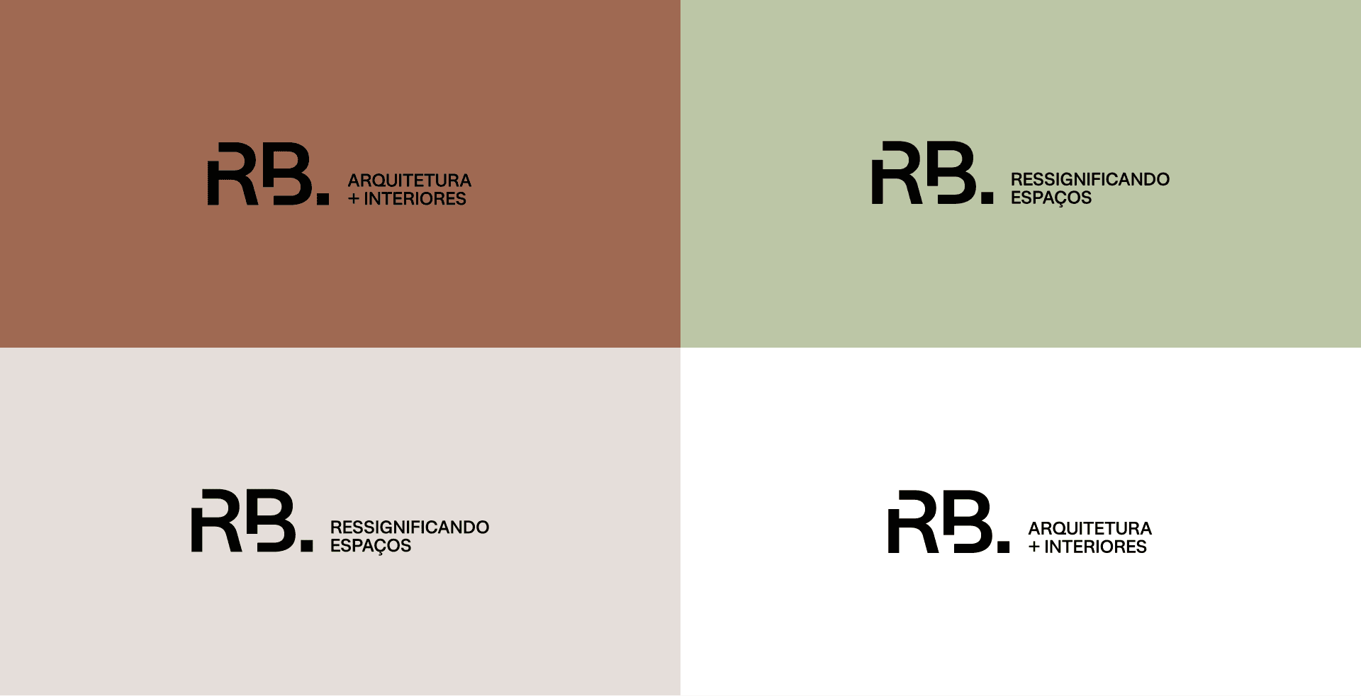
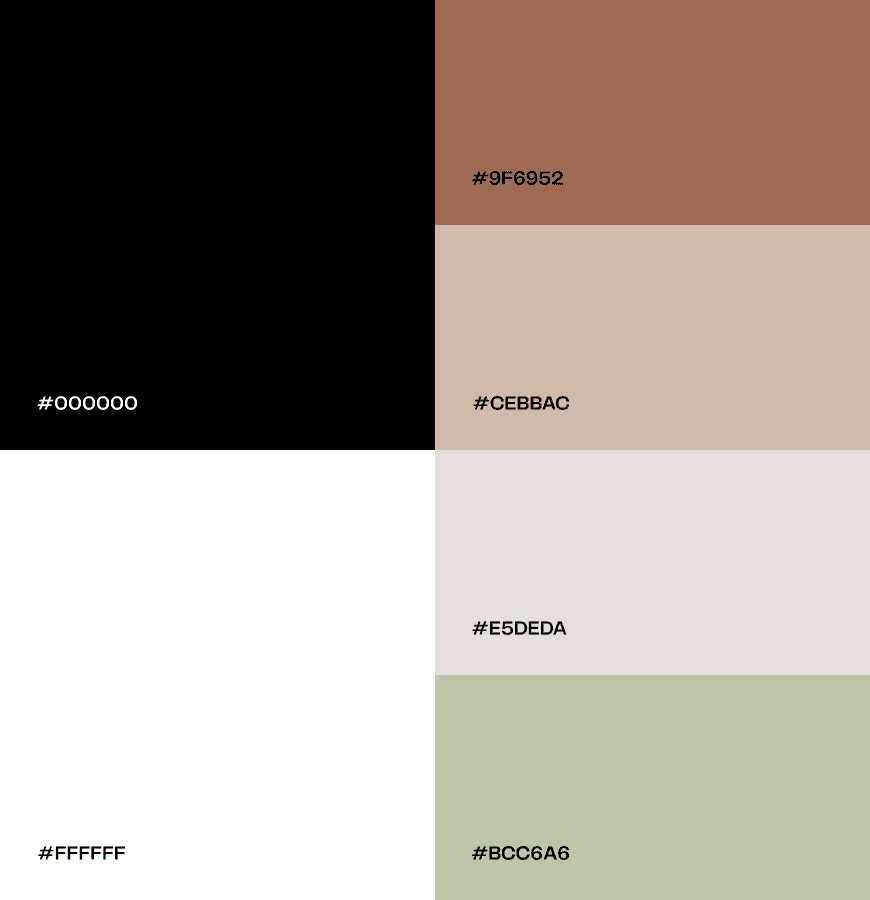
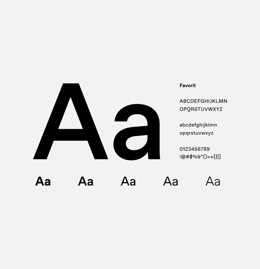
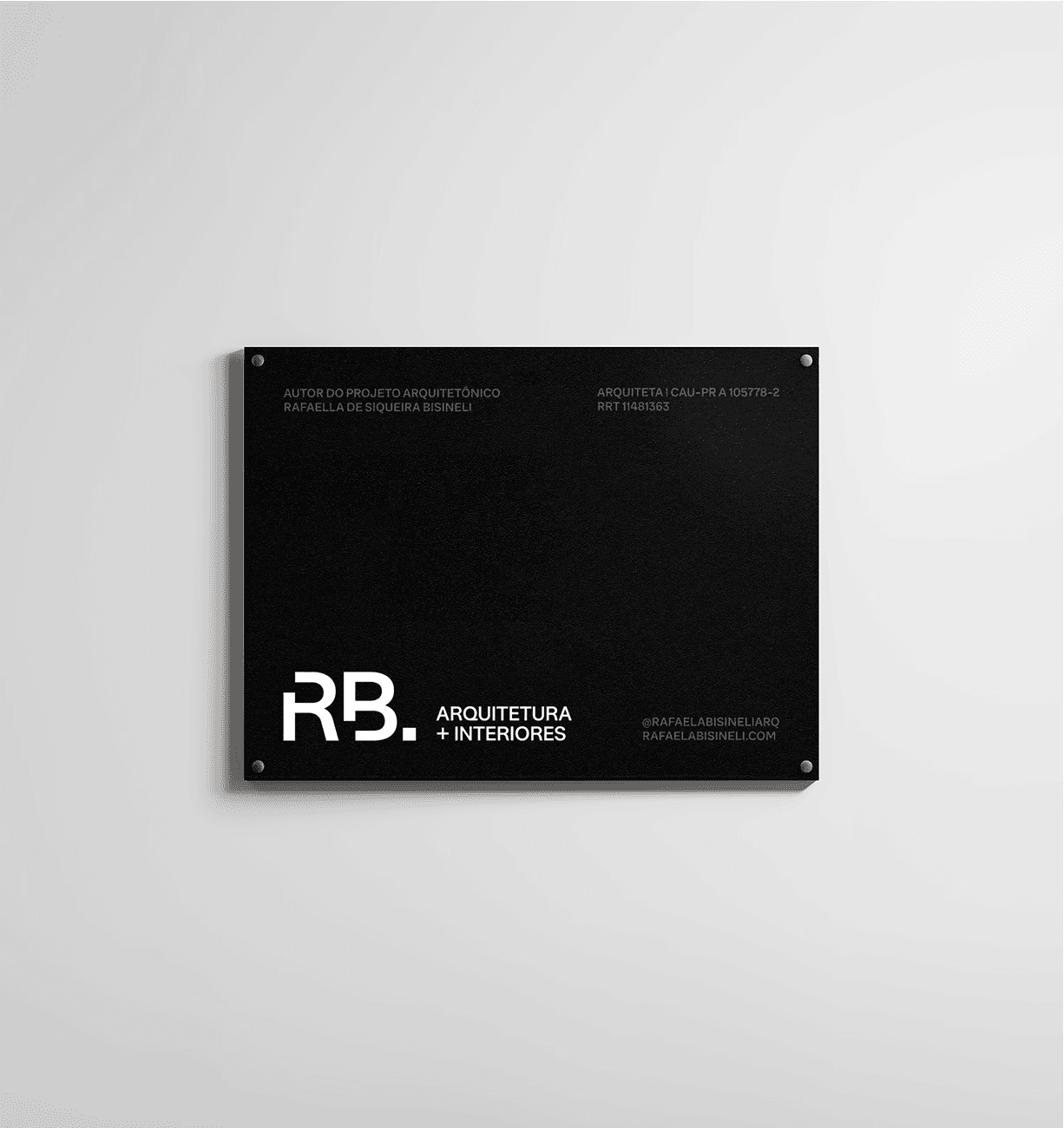
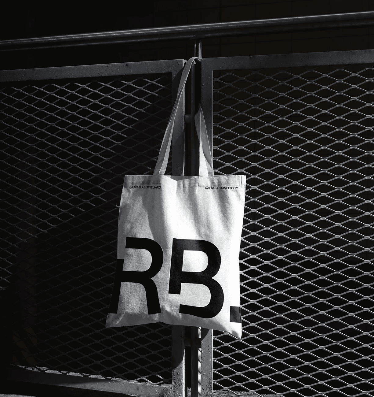
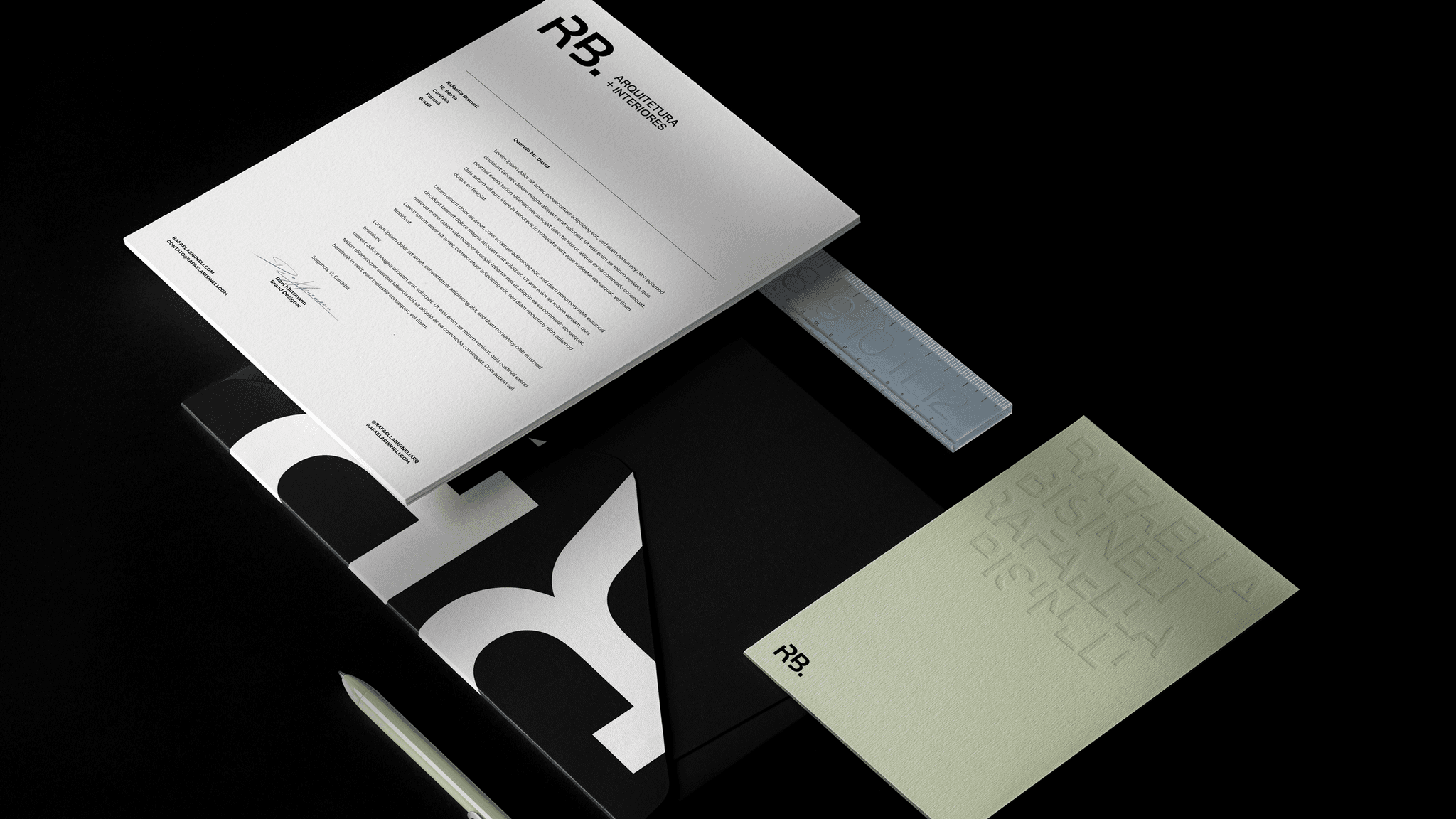
The visual identity employs a chromatic system that balances warm neutrals — such as sand, kraft, and soft browns — with organic greens and deep black, reinforcing elegance, stability, and a connection to natural materials. To ensure clarity and performance, the typography combines Favorit for headings and Manrope for body text, resulting in a modern, readable, and cohesive communication style. The system is minimalistic, versatile, and fully scalable, supporting digital, printed, and institutional applications while solidifying a contemporary and consistent brand presence.
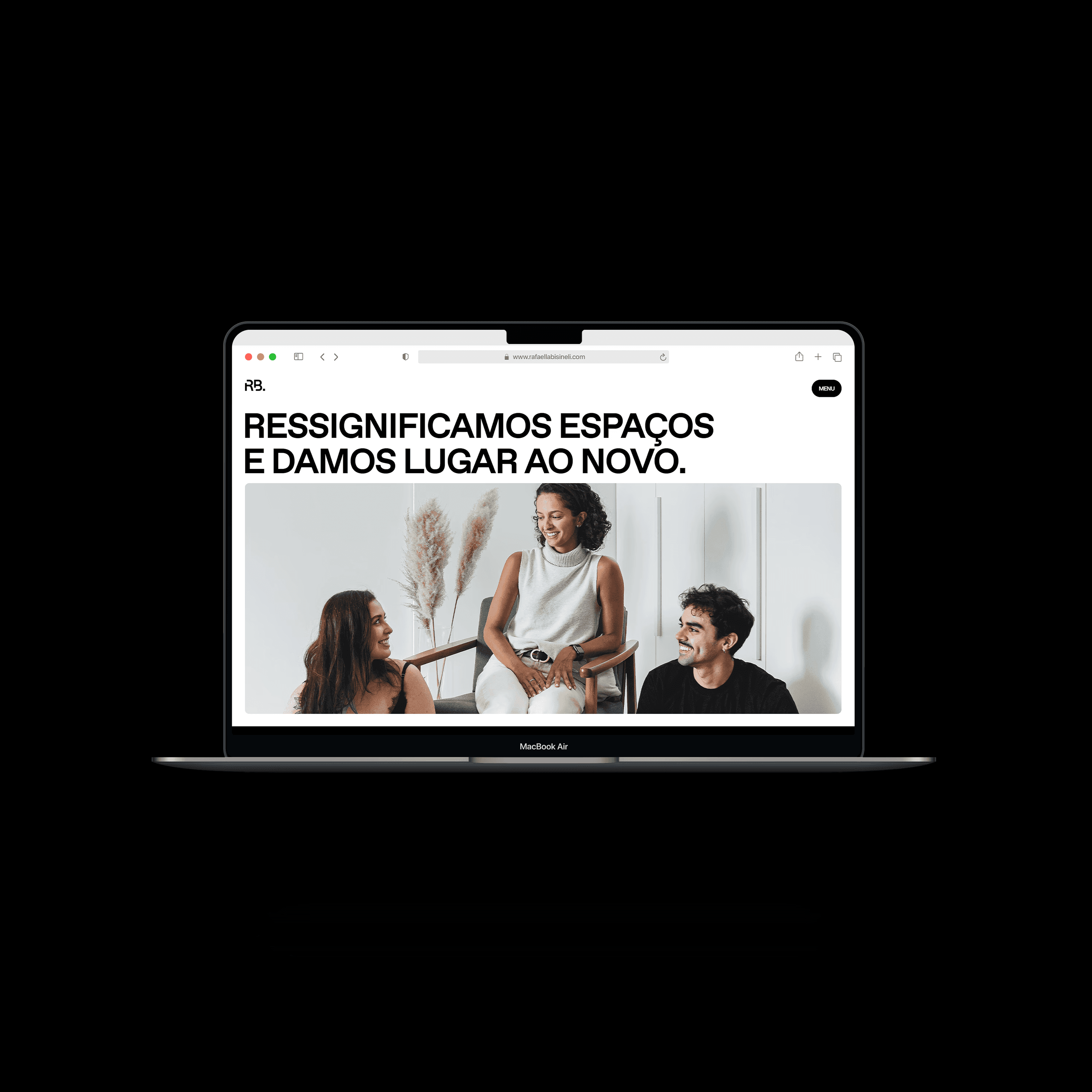
The competitive analysis of architecture studios in Curitiba and the southern region of Brazil revealed a recurring pattern: overly dense websites, excessive visual elements, and structures that diluted the core message. This mapping highlighted an opportunity to differentiate through a lean, disciplined, and highly objective digital presence. This direction enabled the creation of a website that stands out for its strategic clarity, visual maturity, and cohesive brand communication.
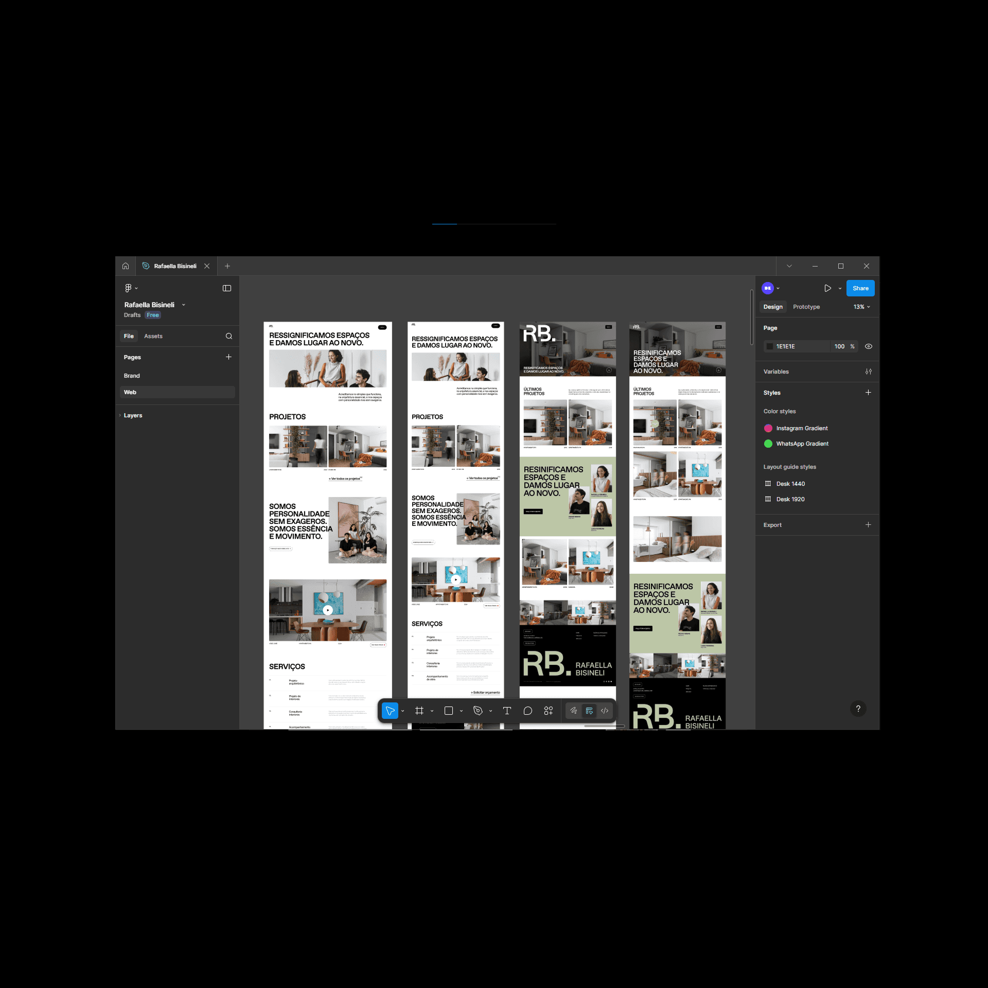
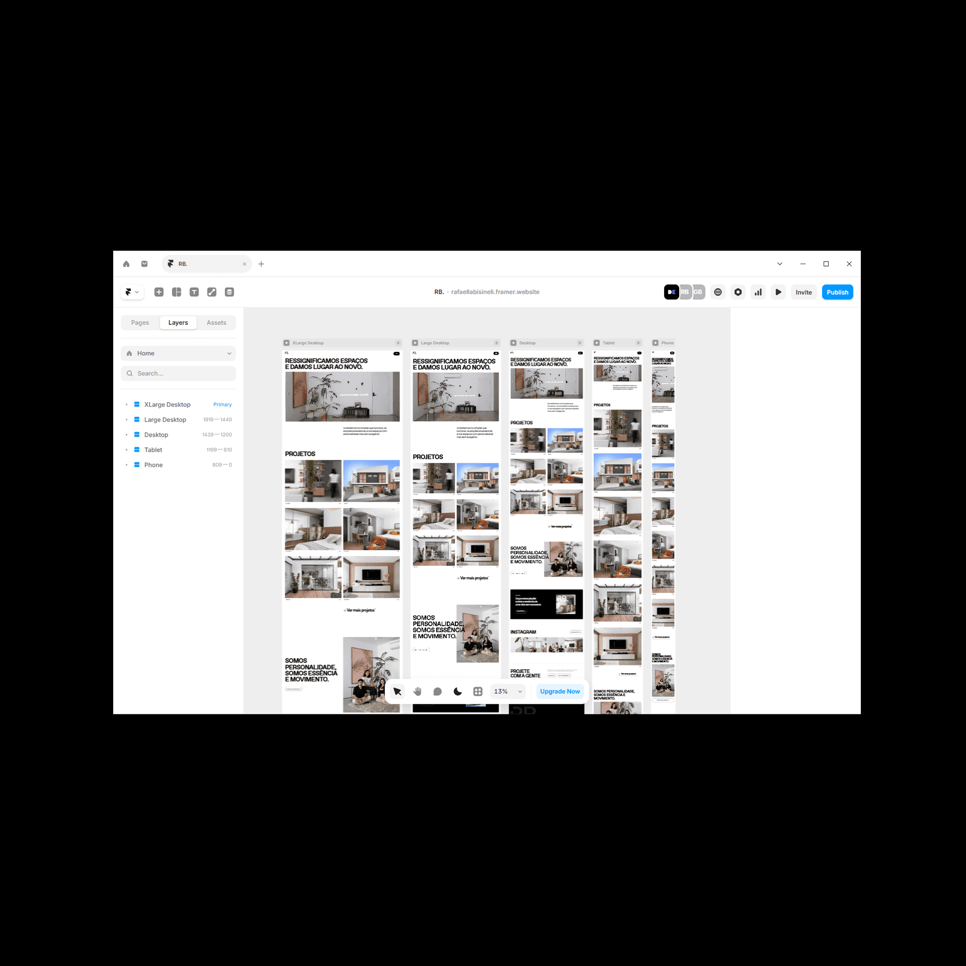
The challenge was to create a website that not only communicated the studio’s positioning with clarity and sophistication, but also operated as a flexible digital ecosystem capable of evolving alongside the client’s work. To achieve this, the entire project was developed in Framer, a platform that enables designers to build visually refined websites while giving clients an intuitive interface for ongoing edits and updates.
The solution integrates a minimalist structure with strategic usability choices. Each breakpoint is meticulously organized, ensuring responsive behavior across devices. Modular sections allow content to adapt seamlessly, while the information architecture emphasizes flow, readability, and a strong visual hierarchy. Within Framer, updates such as adding new projects, adjusting layouts, or modifying text can be done quickly and without technical barriers.
This approach not only aligns perfectly with the studio’s clean, contemporary identity but also empowers the client with autonomy, agility, and a long-term digital framework designed to grow with the brand. The result is a seamless browsing experience where aesthetics, functionality, and maintainability coexist in complete harmony.