Year
Industry
Services

About the project
Designing commercial spaces in a sophisticated city like Curitiba requires authority, repertoire, advanced technical expertise and vision. Architect and entrepreneur André Henning needed a visual identity that reflected not only his technical mastery but also his solid presence in the southern Brazilian market. The challenge was to create a brand that communicates professionalism, modernity and exclusivity, reinforcing his position as a specialist in bold, intelligent and highly strategic architectural projects.
Concept
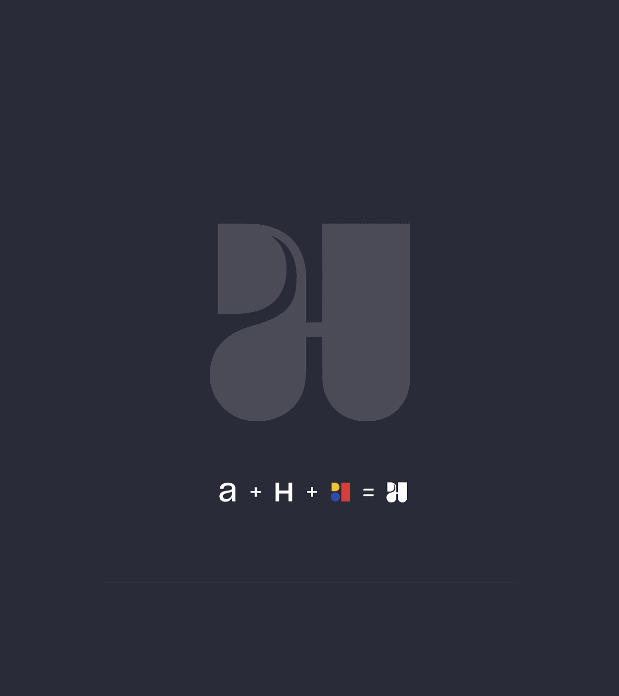
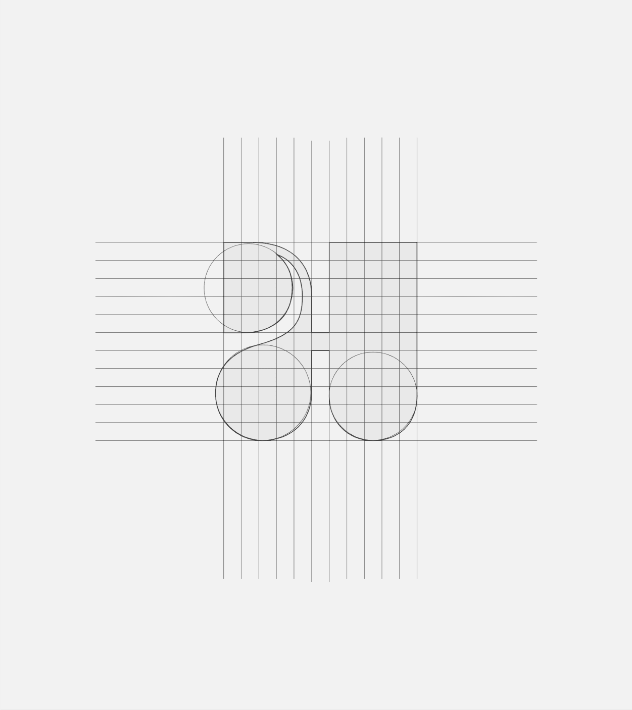
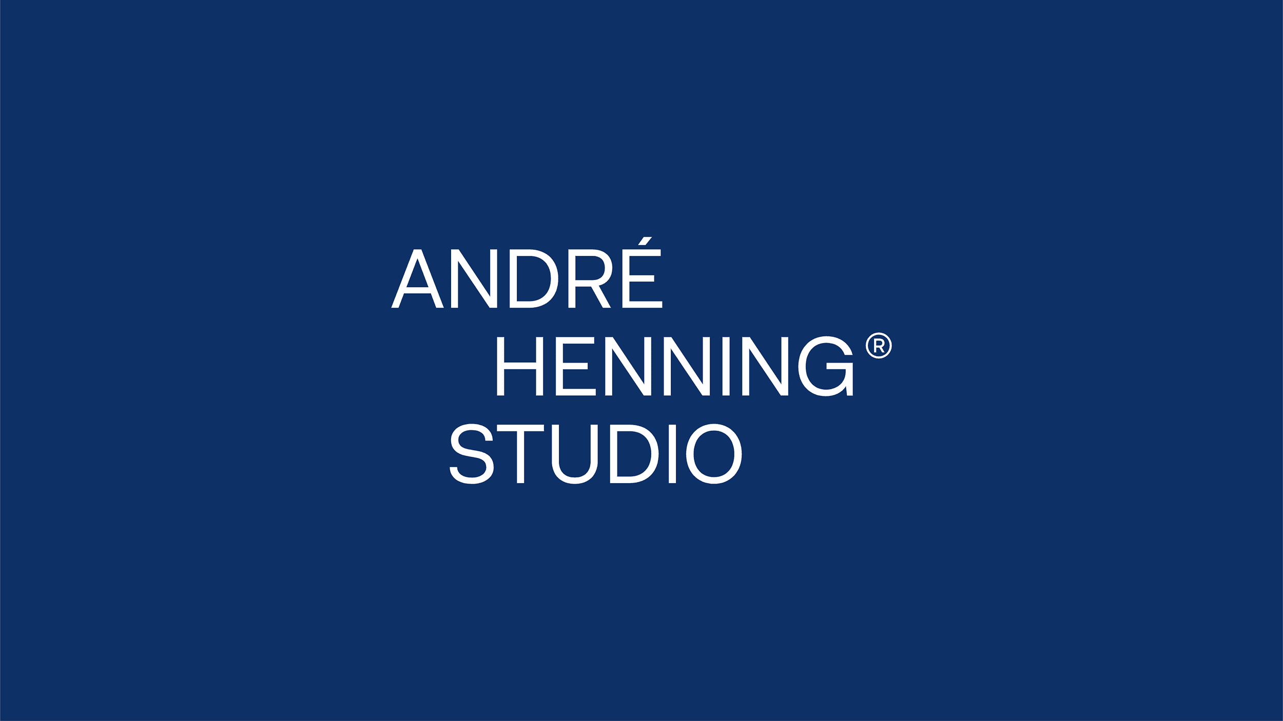
The concept emerges from the intersection of geometry, technique and personality. Inspired by Bauhaus principles, the symbol was crafted using geometric forms that shape the initials A and H, resulting in a brand that reflects balance between architectural rationality and aesthetic sensitivity. The identity conveys innovation, solidity and originality — essential qualities for representing André Henning’s contemporary
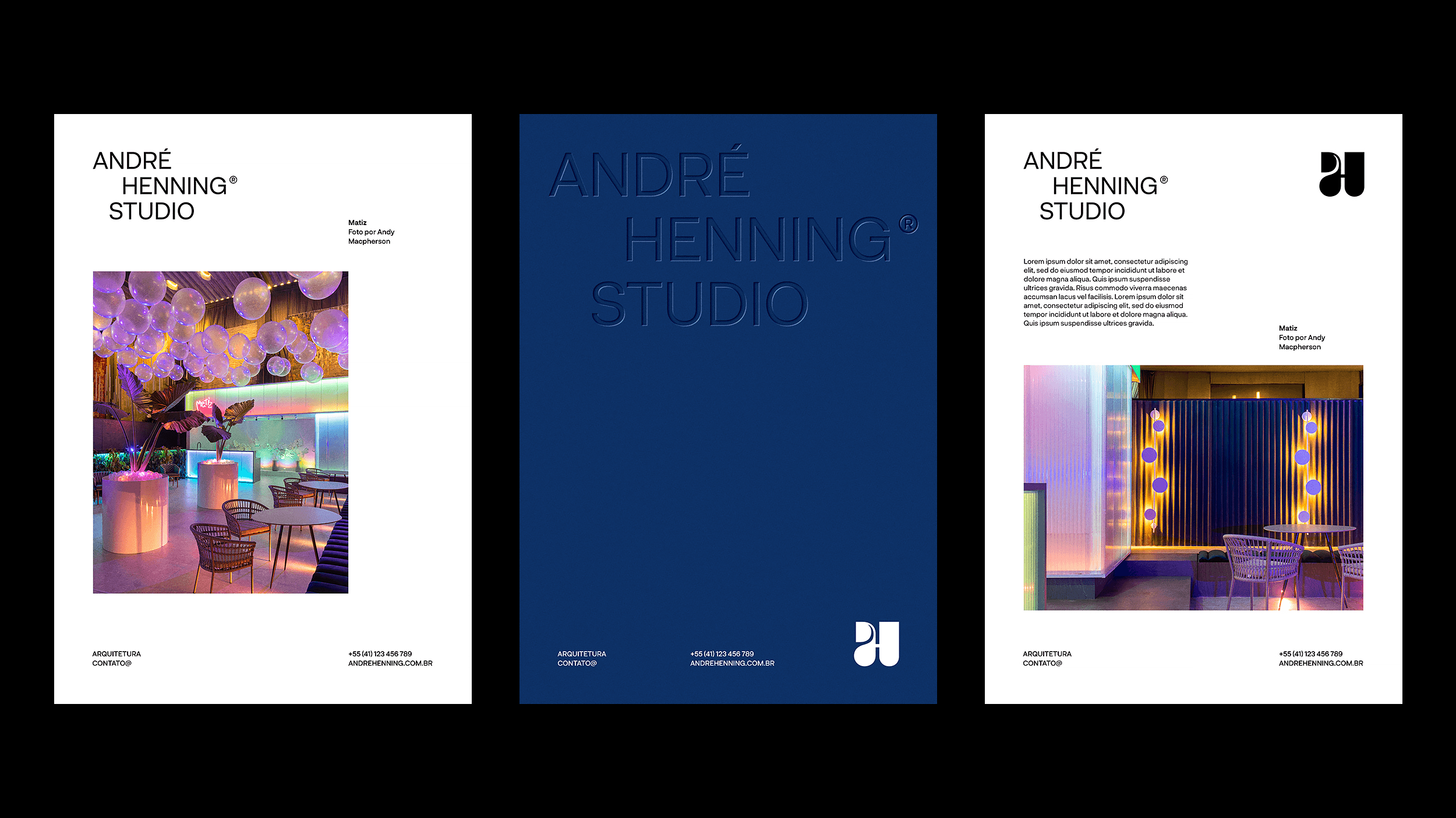
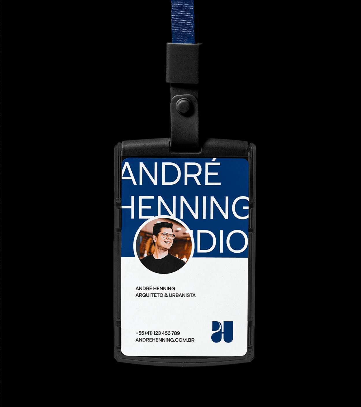
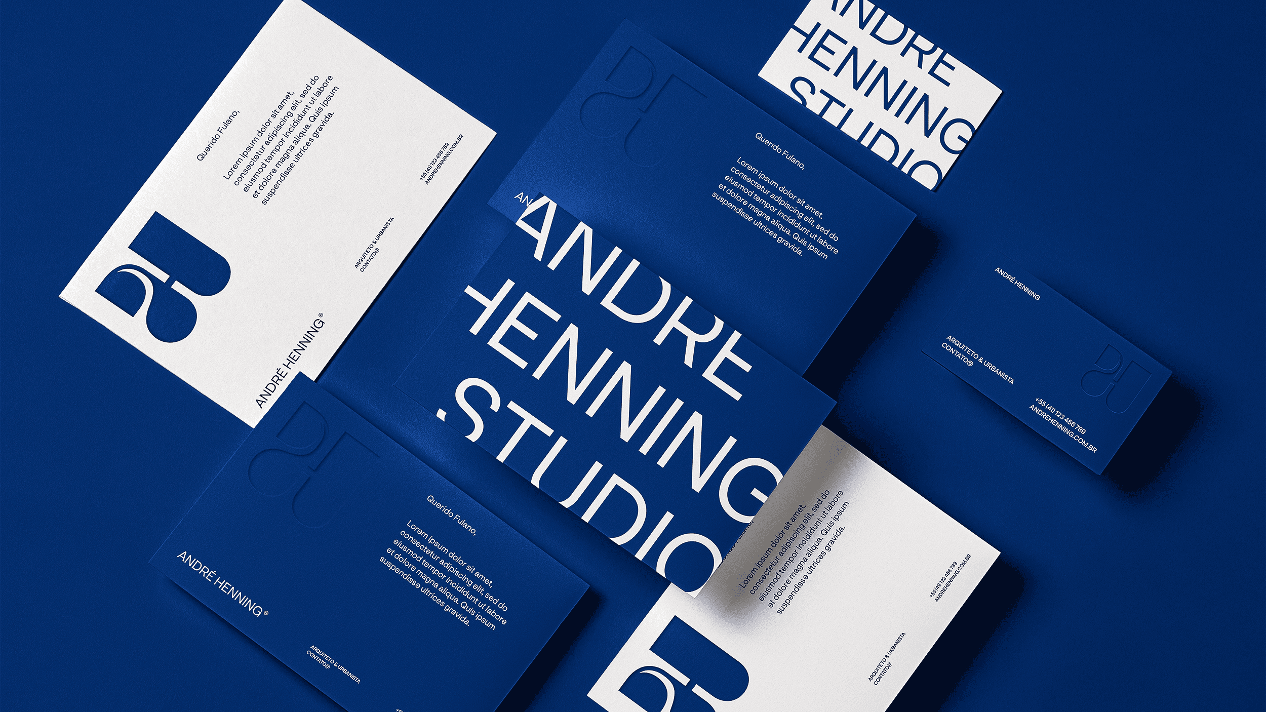
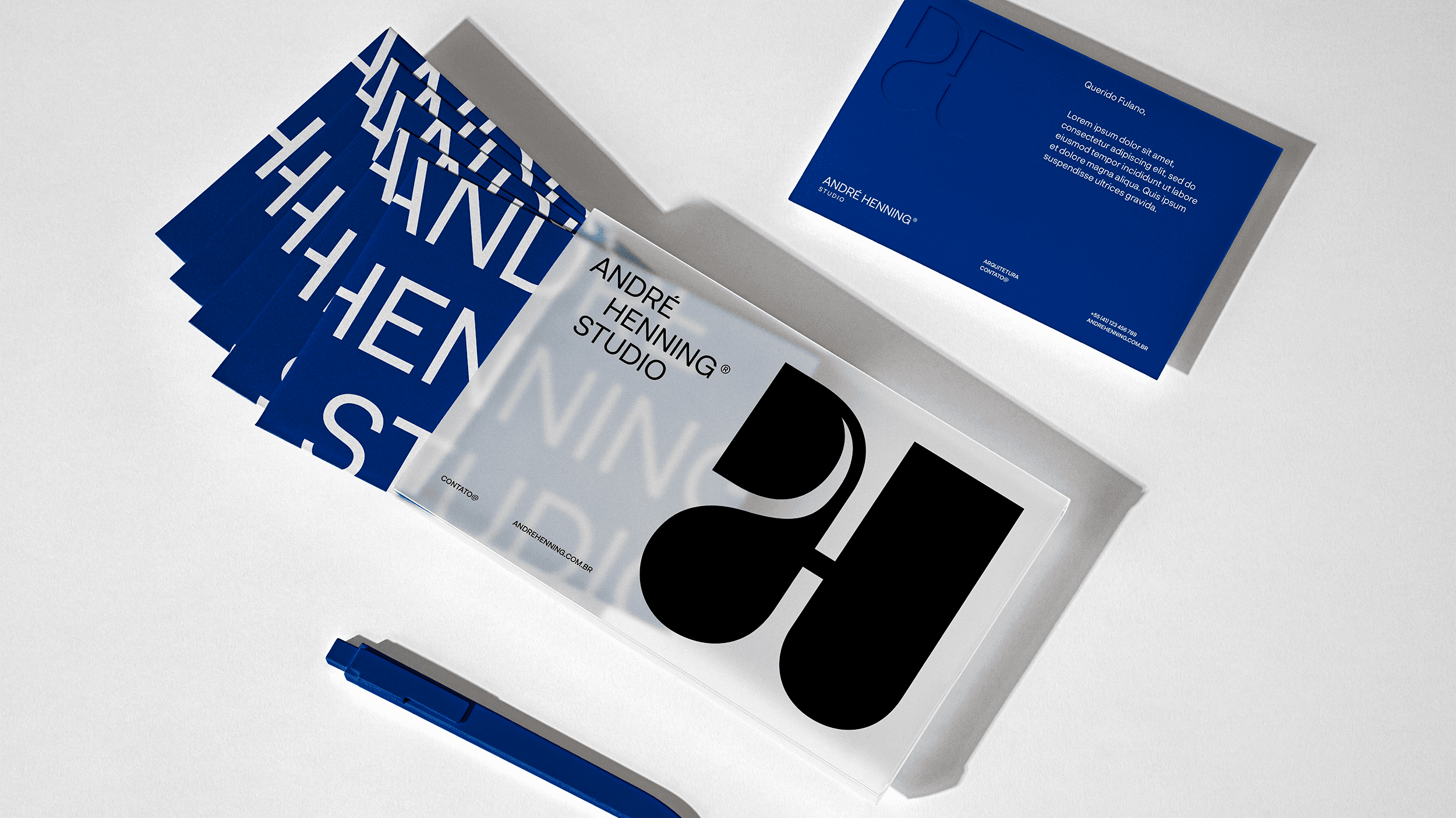
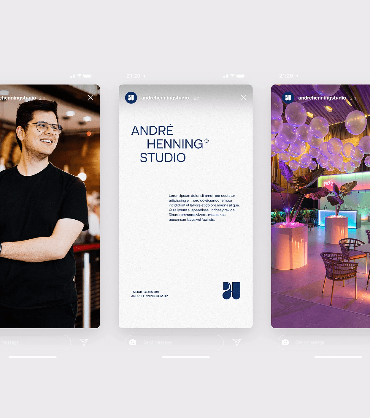
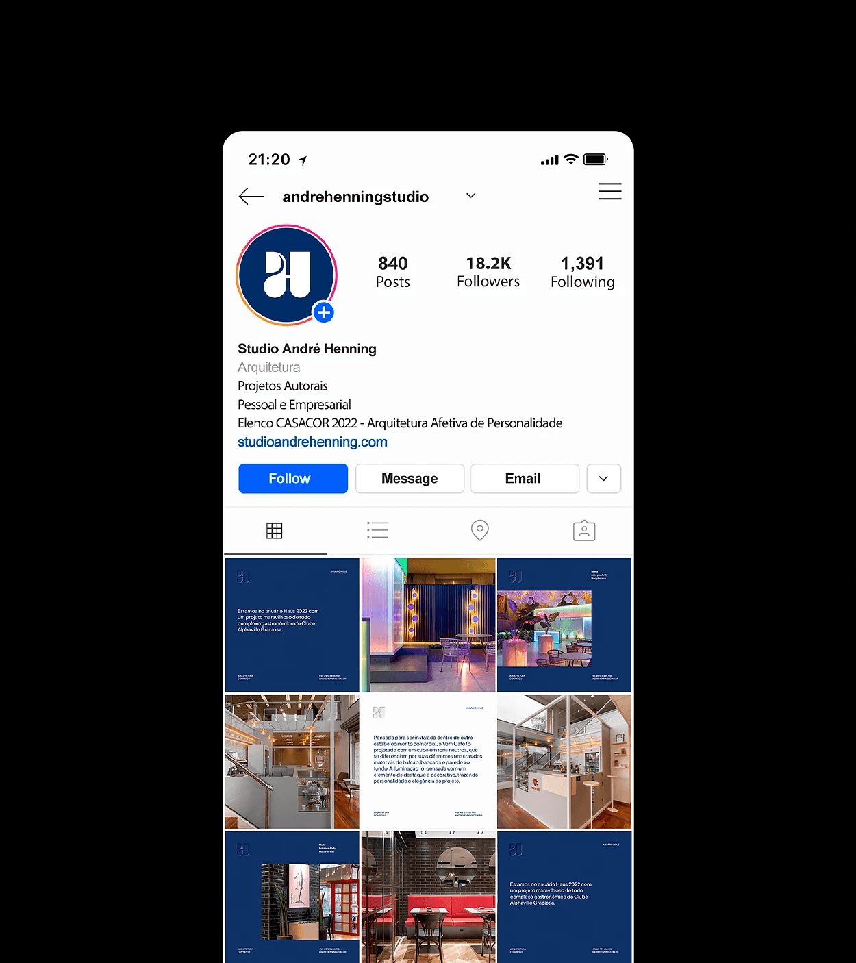
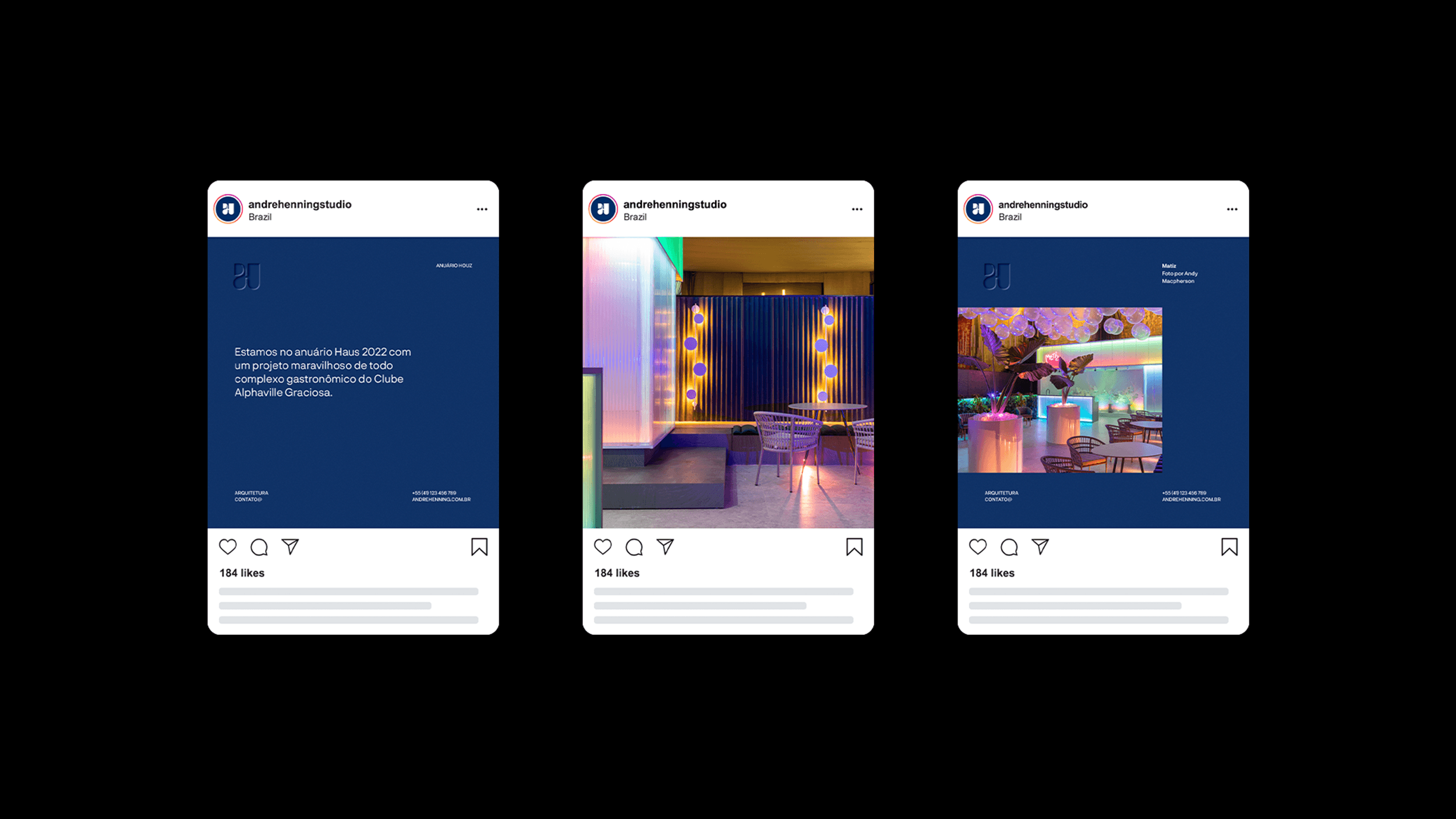
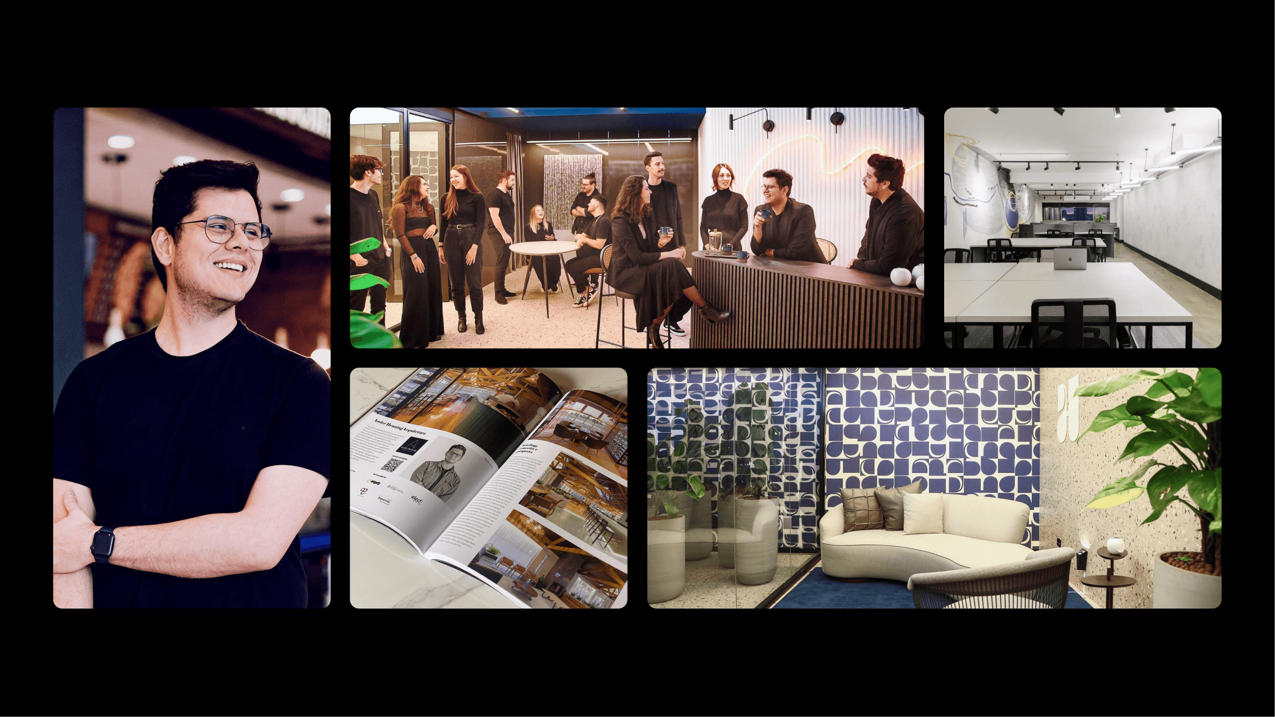
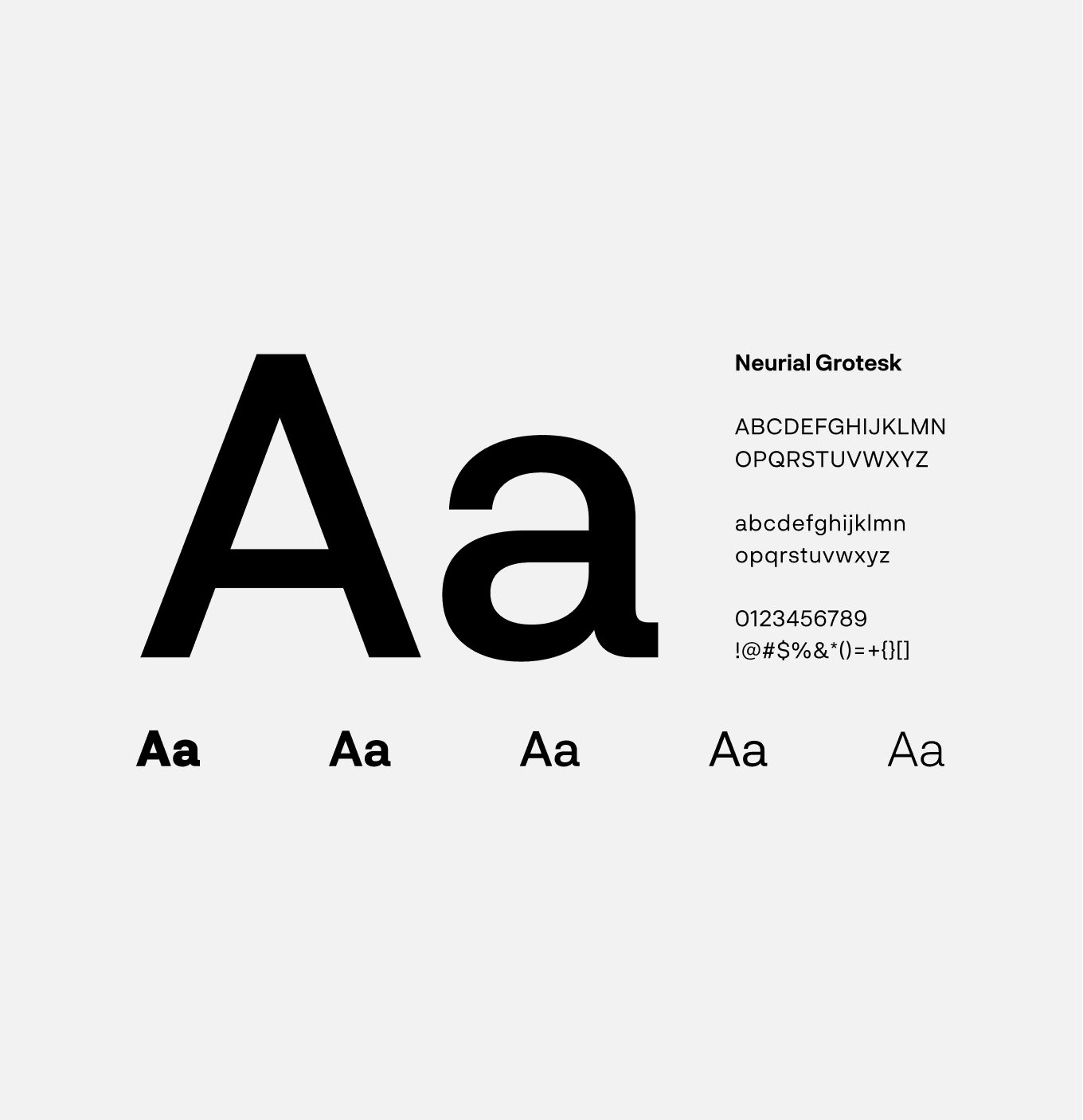
The visual identity was developed around minimalist elegance and strong visual impact. The color palette combines black, white, deep blue and earthy tones, creating a refined and professional contrast. Neurial Grotesk typography reinforces modernity and precision, while the geometric symbol stands out as a distinctive and memorable element. Together, these components form a clean, versatile and authorial identity, adaptable to various architectural and commercial contexts.


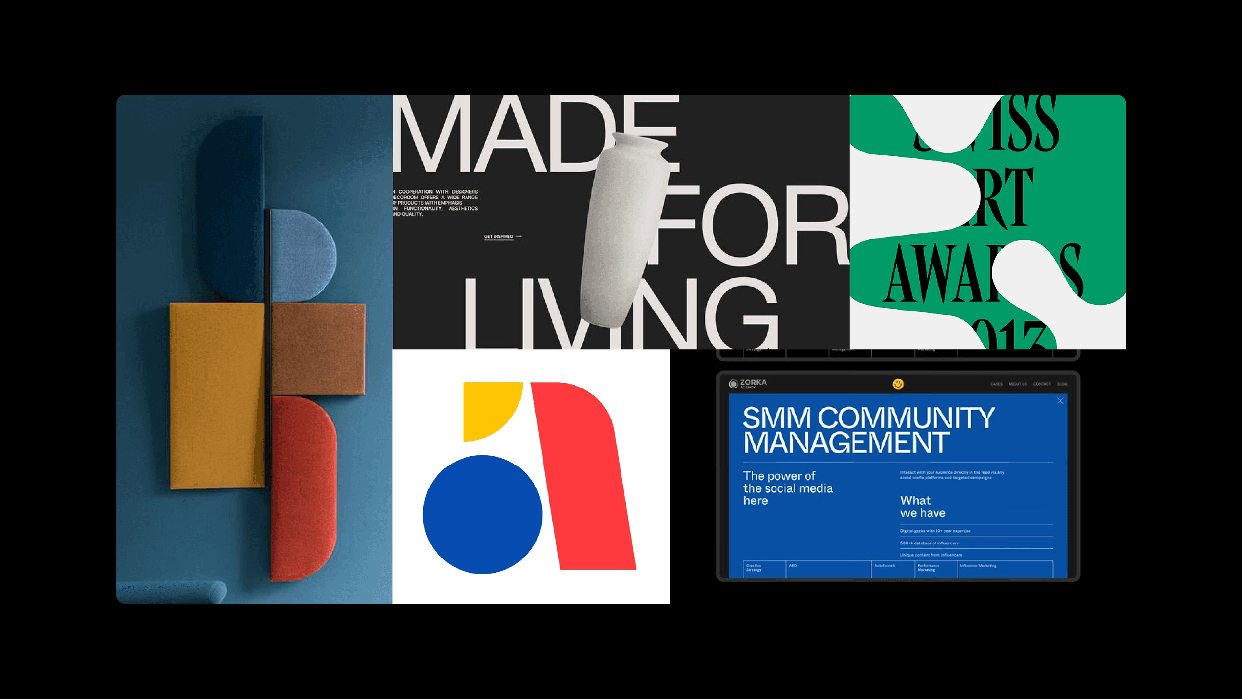
The applications demonstrate the brand’s strength across different touchpoints: printed materials, social media, stationery, signage and presentations. The visual system remains cohesive and elegant in minimalist layouts, monochromatic backgrounds and photographic compositions, reinforcing the studio’s premium and innovative positioning.